Designing a responsive website has been an exciting challenge that tests the potential of your design. This project focused on user experience and research which rationalises design decisions. You can try HYPO in this link here.

This website was designed for people with a slow metabolism/hypothyroidism who would like to take care of their physical and mental health. Hypo is a website/web app that provides ways to have a better lifestyle, weight loss plans, and information unlike heavily dense medical fact-based websites our product provides essential and personalised information tailored to the user’s case and needs.
After interviewing a person with a slow metabolism and working with classmates on personas,
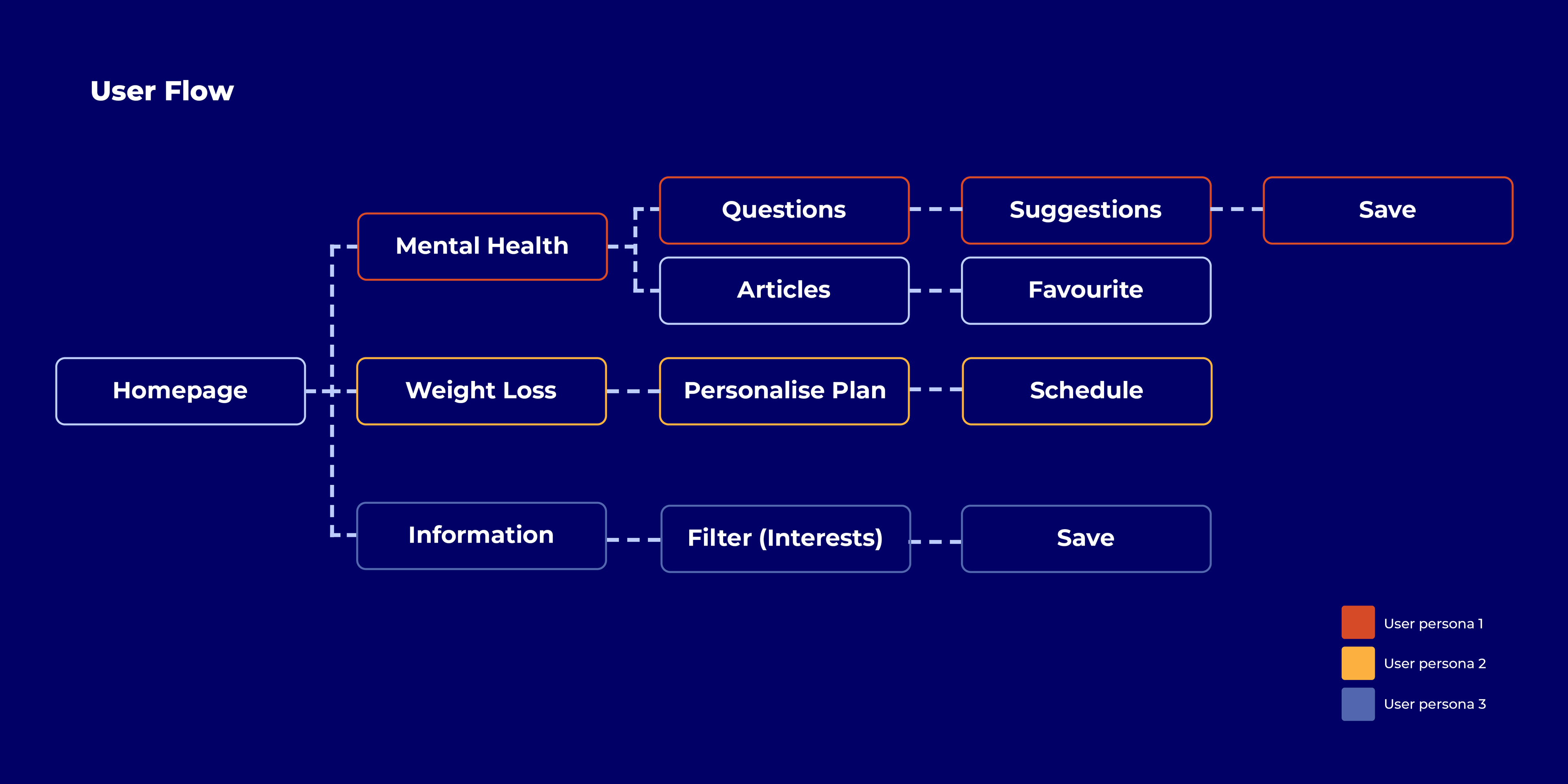
I have developed a user flow that breaks down the three personas' navigation. It was important to have three main call–to–actions; feel better, lose weight and learn more about hypothyroidism which provides the user with a clear understanding of the content of the website and the ways it can meet their needs.
I have developed a user flow that breaks down the three personas' navigation. It was important to have three main call–to–actions; feel better, lose weight and learn more about hypothyroidism which provides the user with a clear understanding of the content of the website and the ways it can meet their needs.
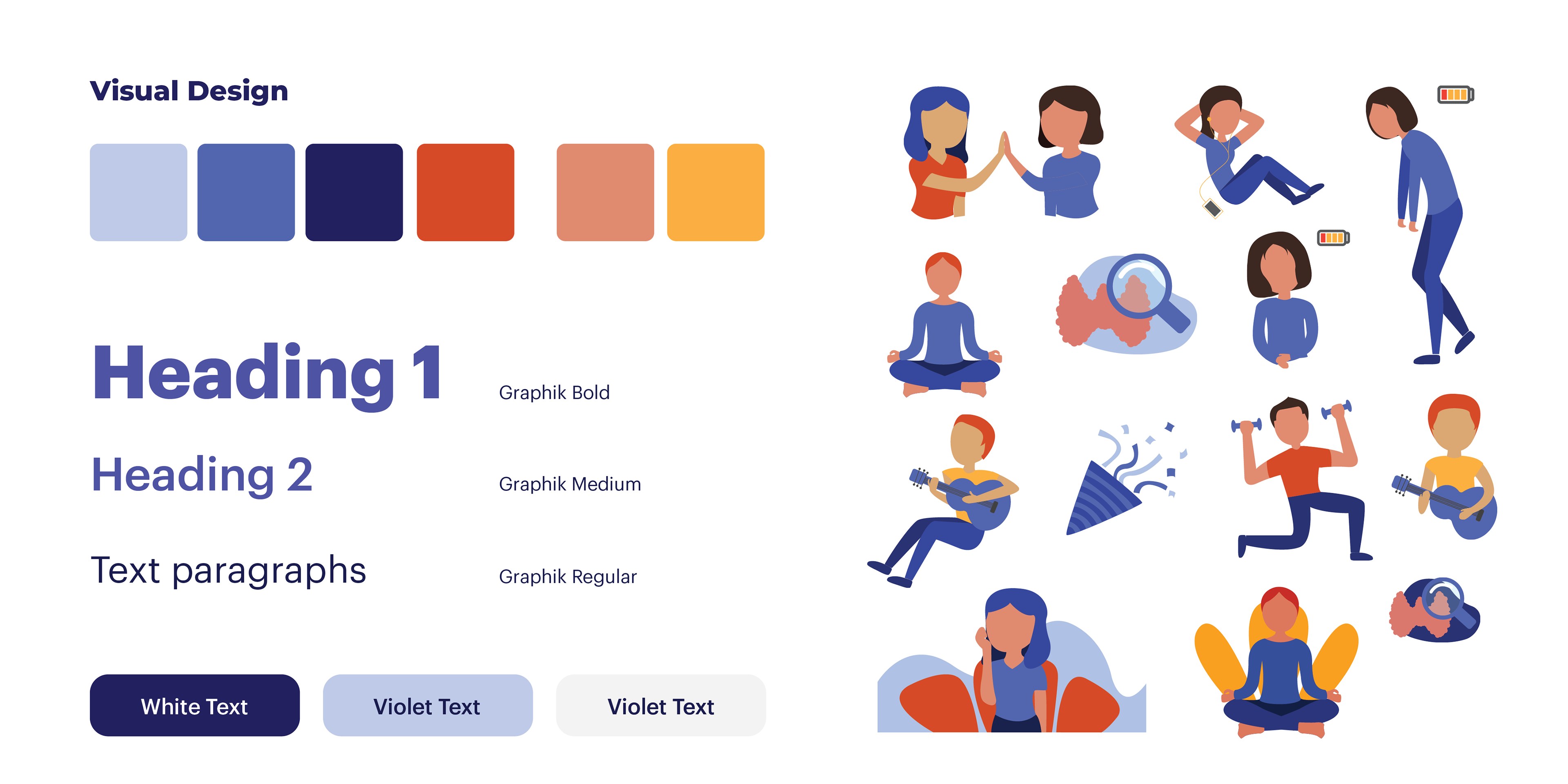
HYPO's visual design was inspired by modern website trends which rely on illustrations and colour to create a brand identity. The forms for the illustrations are very organic and simple to allude to mental health by making the user interface relaxing and visually appealing.
A main feature of the website is personalising and sharing your interest to view and save relevant and useful information. Features such as quizzes and filtering allow for the site to acknowledge the user's needs and be able to suggest solutions and relevant content.
You can try the desktop prototype yourself in this link.